Remix an Infographic
Practice telling a data story in different ways
Preparação
This activity will take 30 to 40 minutes. You should have these materials on hand:
-
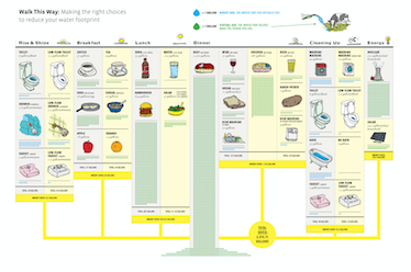
Printed copies of an example visualization for remixing. We often use this infographic on daily water usage from GOOD.is. 1-2 printed copies for each group.
- Large paper, markers, and craft materials (the materials from our Build a Data Sculpture activity can be used for this activity too)
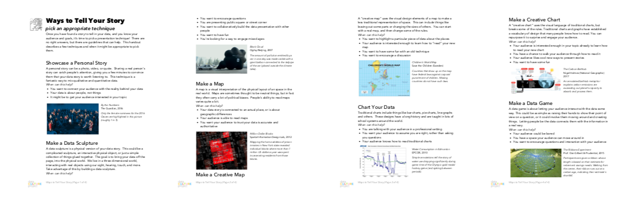
- Copies of our handout about different data presentation techniques (1 for each participant)
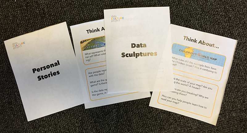
- Our visualization technique cards (one card for each 3-4 person group); print them double-sided on a single sheet of paper and cut them out ahead of time
Contexto
In order to tell your data story well, you need a good “toolbelt” of presentation techniques to pull from. However, we often only consider a small set of techniques — primarily traditional charts and maps — when we display data. This activity introduces participants to data presentation techniques that are creative, fun, and better suited for certain audiences than traditional charts and maps. It lets participants practice using these techniques, and helps them build confidence in their ability to present data appropriately.
Início da Atividade
Present slideshow about creative techniques.
Give participants copies of the visualization techniques handout, and walk them through the descriptions and examples of each technique provided in the slides (spend about 2 minutes on each technique). These concrete examples help people expand their toolbelt.
Discuss the example visualization.
Introduce the sample visualization you have chosen and discuss its audience, goals, and content. We like to use this infographic on water usage from GOOD.is. It is quite opinionated, so its message and goal are clear. Direct participants to compare beef with all other water usage - it far exceeds everything else on the page!
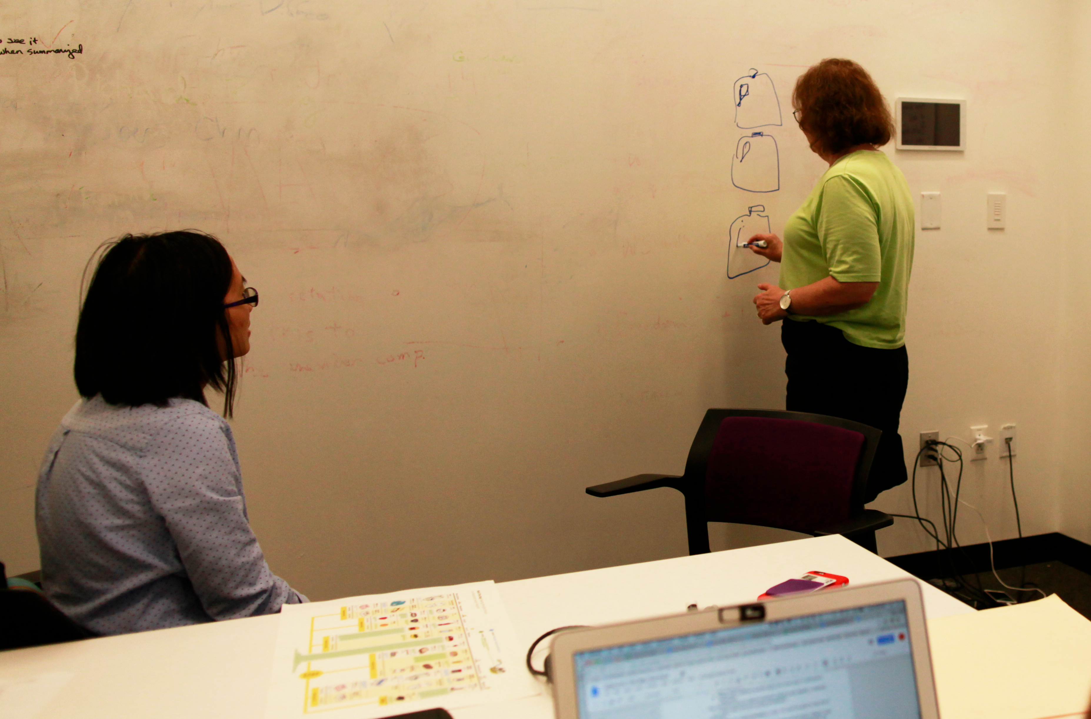
Start Remixing
Bring everyone back together and go around the room letting each group share their favorite idea. Have groups talk about different editorial decisions that were made in narrowing down their ideas. Ask the groups for their thoughts about the relative strengths and weaknesses of each technique as well as which audiences might be particularly well served by different presentation techniques.
Faça com que Todos Compartilhem
Review the key points in the conversation that you just had. Remind the participants that data are systematic observations of the world, and a dataset is the collection of those observations. Data are a helpful reduction of the world, but it’s important to keep in mind that they do not capture everything. Data can capture different types of information (quantitative, qualitative, temporal, geographic, etc.), and the type of the data affects the kinds of exploration and pattern seeking that you can do. Data often needs to be cleaned and standardized. Data storytelling and analysis involves looking for patterns, making comparisons, finding outliers, and then testing that knowledge in dialogue with others. Finally, the way data are collected and used can raise questions of privacy, consent, and ethics, which must be taken into account when analyzing and presenting them.